Histograms And Box Plots
Data Set
Histograms And Box Plots
In the last mission, we learned how to create bar plots to compare the average user rating a movie received from four movie review sites. We also learned how to create scatter plots to explore how ratings on one site compare with ratings on another site. We ended the mission with the observations that user ratings from Metacritic and Rotten Tomatoes spanned a larger range (1.0 to 5.0) while those from Fandango and IMDB spanned a smaller range (2.5 to 5 and 2 to 5 respectively).
In this mission, we'll learn how to visualize the distributions of user ratings using histograms and box plots. We'll continue working with the same dataset from the last mission. Recall that you can download the dataset fandango_scores.csv from the FiveThirtEight Github repo. We've read the dataset into pandas, selected the columns we're going to work with, and assigned the new Dataframe to norm_reviews.
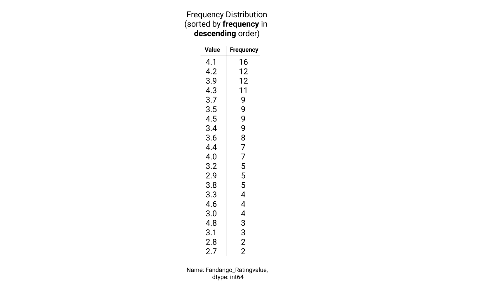
Let's first compare the frequency distributions of user ratings from Fandango with those from IMDB using tables. A column's frequency distribution consists of the unique values in that column along with the count for each of those values (or their frequency). We can use Series.value_counts() to return the frequency distribution as Series object:
The resulting Series object will be sorted by frequency in descending order:

While this ordering is helpful when we're looking to quickly find the most common values in a given column, it's not helpful when trying to understand the range that the values in the column span. We can use Series.sort_index() to sort the frequency distribution in ascending order by the values in the column (which make up the index for the Series object):
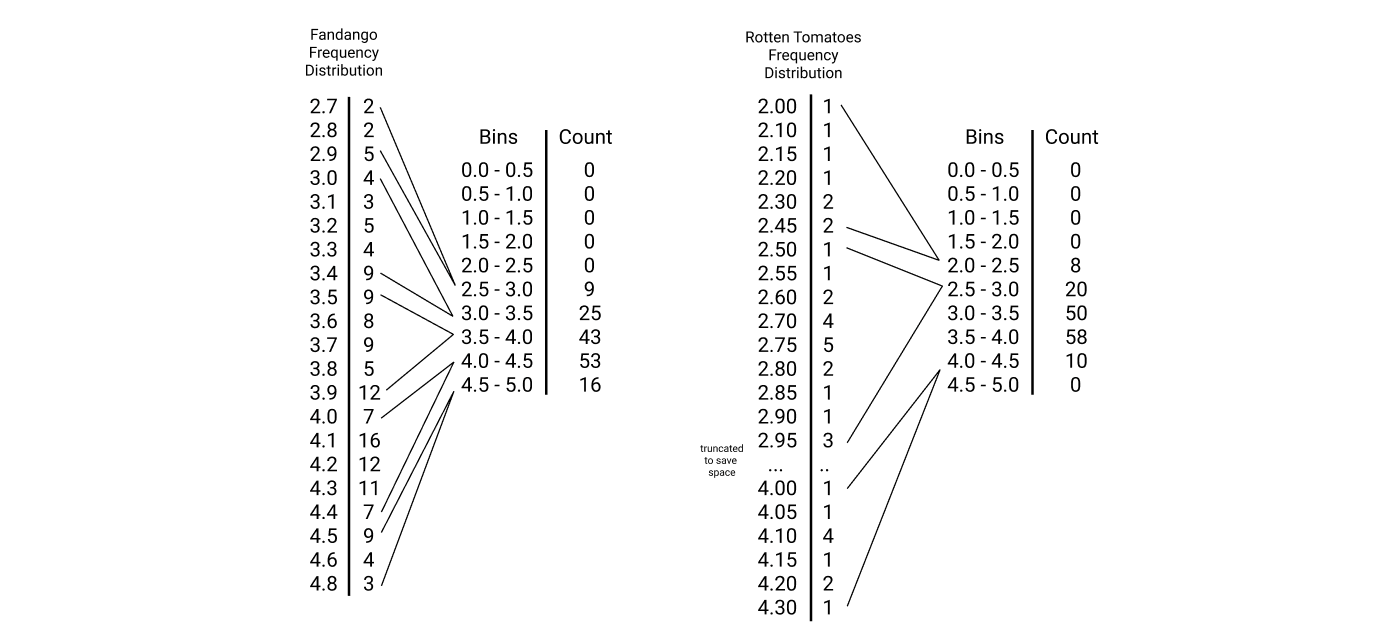
Here's what both frequency distributions look like side-by-side:

Instructions
Use the
value_counts()method to return the frequency counts for theFandango_Ratingvaluecolumn. Sort the resulting Series object by the index and assign tofandango_distribution.Use the
value_counts()method to return frequency counts theIMDB_normcolumn. Sort the resulting Series object by the index and assign toimdb_distribution.Use the
print()function to displayfandango_distributionandimdb_distribution.
Because there are only a few unique values, we can quickly scan the frequency counts and confirm that the Fandango_Ratingvalue column ranges from 2.7 to 4.8 while the IMDB_norm column ranges from 2 to 4.3. While we can quickly determine the minimum and maximum values, we struggle to answer the following questions about a column:
What percent of the ratings are contained in the 2.0 to 4.0 range?
How does this compare with other sites?
Which values represent the top 25% of the ratings? The bottom 25%?
How does this compare with other sites?
Comparing frequency distributions is also challenging because the Fandango_Ratingvalue column contains 21 unique values while IMDB_norm contains 41 unique values. We need a way to compare frequencies across a shared set of values. Because all ratings have been normalized to a range of 0 to 5, we can start by dividing the range of possible values into a series of fixed length intervals, called bins. We can then sum the frequencies for the values that fall into each bin. Here's a diagram that makes binning easier to understand:

The distributions for both of these columns are now easier to compare because of the shared x-axis (the bins). We can now plot the bins along with the frequency sums as a bar plot. This type of plot is called a histogram. Let's dive right into creating a histogram in matplotlib.
We can generate a histogram using Axes.hist(). This method has only 1 required parameter, an iterable object containing the values we want a histogram for. By default, matplotlib will:
calculate the minimum and maximum value from the sequence of values we passed in
create 10 bins of equal length that span the range from the minimum to the maximum value
group unique values into the bins
sum up the associated unique values
generate a bar for the frequency sum for each bin
The default behavior of Axes.hist() is problematic for the use case of comparing distributions for multiple columns using the same binning strategy. This is because the binning strategy for each column would depend on the minimum and maximum values, instead of a shared binning strategy. We can use the range parameter to specify the range we want matplotlib to use as a tuple:
While histograms use bars whose lengths are scaled to the values they're representing, they differ from bar plots in a few ways. Histograms help us visualize continuous values using bins while bar plots help us visualize discrete values. The locations of the bars on the x-axis matter in a histogram but they don't in a simple bar plot. Lastly, bar plots also have gaps between the bars, to emphasize that the values are discrete.
Instructions
Create a single subplot and assign the returned Figure object to
figand the returned Axes object toax.Generate a histogram from the values in the
Fandango_Ratingvaluecolumn using a range of0to5.Use
plt.show()to display the plot.
If you recall, one of the questions we were looking to answer was:
What percent of the ratings are contained in the 2.0 to 4.0 range?
We can visually examine the proportional area that the bars in the 2.0 to 4.0 range take up and determine that more than 50% of the movies on Fandango fall in this range. We can increase the number of bins from 10 to 20 for improved resolution of the distribution. The length of each bin will be 0.25 (5 / 20) instead of 0.5 (5 / 10). The bins parameter for Axes.hist() is the 2nd positional parameter, but can also be specified as a named parameter:
Let's now generate histograms using 20 bins for all four columns. To ensure that the scales for the y-axis are the same for all histograms, let's set them manually using Axes.set_ylim().
Instructions
We have provided starter code as comments in the code editor. Select all of these lines and press ctrl + / (PC) or ⌘ + / (Mac) to uncomment these lines so you can use it. For a demo of how this keyboard shortcut works, see this help article.
For the subplot associated with
ax1:Generate a histogram of the values in the
Fandango_Ratingvaluecolumn using 20 bins and a range of0to5.Set the title to
Distribution of Fandango Ratings.
For the subplot associated with
ax2:Generate a histogram of the values in the
RT_user_normcolumn using 20 bins and a range of0to5.Set the title to
Distribution of Rotten Tomatoes Ratings.
For the subplot associated with
ax3:Generate a histogram of the values in the
Metacritic_user_nomcolumn using 20 bins and a range of0to5.Set the title to
Distribution of Metacritic Ratings.
For the subplot associated with
ax4:Generate a histogram of the values in the
IMDB_normcolumn using 20 bins and a range of0to5.Set the title to
Distribution of IMDB Ratings.
For all subplots:
Set the y-axis range to
0to50usingAxes.set_ylim().
Use
plt.show()to display the plots.
A box plot consists of box-and-whisker diagrams, which represents the different quartiles in a visual way. Here's a box plot of the values in the RT_user_norm column:

The two regions contained within the box in the middle make up the interquartile range, or IQR. The IQR is used to measure dispersion of the values. The ratio of the length of the box to the whiskers around the box helps us understand how values in the distribution are spread out.
We can generate a boxplot using Axes.boxplot().
Matplotlib will sort the values, calculate the quartiles that divide the values into four equal regions, and generate the box and whisker diagram.
Instructions
Create a single subplot and assign the returned Figure object to
figand the returned Axes object toax.Generate a box plot from the values in the
RT_user_normcolumn.Set the y-axis limit to range from
0to5.Set the x-axis tick label to
Rotten Tomatoes.
Use
plt.show()to display the plot.
From the box plot we generated using Rotten Tomatoes ratings, we can conclude that:
the bottom 25% of user ratings range from around 1 to 2.5
the top 25% of of user ratings range from around 4 to 4.6
To compare the lower and upper ranges with those for the other columns, we need to generate multiple box-and-whisker diagrams in the same box plot. When selecting multiple columns to pass in to Axes.boxplot(), we need to use the values accessor to return a multi-dimensional numpy array:
Instructions
Create a single subplot and assign the returned Figure object to
figand the returned Axes object toax.Generate a box plot containing a box-and-whisker diagram for each column in
num_cols.Set the x-axis tick labels to the column names in
num_colsand rotate the ticks by90degrees.Set the y-axis limit to range from
0to5.Use
plt.show()to display the plot.
From the boxplot, we can reach the following conclusions:
user ratings from Rotten Tomatoes and Metacritic span a larger range of values
user ratings from IMDB and Fandango are both skewed in the positive direction and span a more constrained range of values
In addition, you may have noticed there are a couple user ratings from both Metacritic and IMDB that are just beyond the boxplot's whiskers. These values are called outliers or extreme values. Outliers are usually treated as abnormal values and affect the overall observation of the data set due to their very high or low values.
In this session, we learned how to use histograms and box plots to visualize and compare the distributions of the ratings from the four movie review sites. Next in this course is a guided project, where we'll explore how to use pandas with matplotlib effectively and create more complex plots.
Review
Syntax
Creating a frequency distribution:
norm_reviews['Fandango_RatingValue'].value_counts()Creating a histogram:
ax.hist(norm_reviews['Fandango_RatingValue'])Specifing the lower and upper range of bins within a histogram:
ax.hist(norm_reviews['Fandango_RatingValue'], range=(0,5))Setting y-axis limits:
ax.set_ylim(0,50)Setting number of bins for a histogram:
ax.hist(norm_reviews['Fandango_RatingValue'], bins = 20)Creating a box plot:
ax.boxplot(norm_reviews["RT_user_norm"])Creating a boxplot for multiple columns of data:
num_cols = ['RT_user_norm', 'Metacritic_user_nom', 'IMDB_norm', 'Fandango_Ratingvalue'] ax.boxplot(norm_reviews[num_cols].values)
Concepts
Frequency distribution consists of unique values and corresponding frequencies.
Bins are intervals of fixed length to cover all possible values.
Histogram shows the distribution over numerical data.
Quartiles divide the range of numerical values into four different regions.
Box plot visually shows quartiles of a set of data as well as any outliers.
Outliers are abnormal values that affect the overall observation of the data set due to their very high or low values.
Resources
Last updated