Bar Plots And Scatter Plots
Data Set
In the previous session in this course, we explored trends in unemployment data using line charts. The unemployment data we worked with had 2 columns:
DATE- monthly time stampVALUE- unemployment rate (in percent)
Line charts were an appropriate choice for visualizing this dataset because the rows had a natural ordering to it. Each row reflected information about an event that occurred after the previous row. Changing the order of the rows would make the line chart inaccurate. The lines from one marker to the next helped emphasize the logical connection between the data points.
In this mission, we'll be working with a dataset that has no particular order. Before we explore other plots we can use, let's get familiar with the dataset we'll be working with.
To investigate the potential bias that movie reviews site have, FiveThirtyEight compiled data for 147 films from 2015 that have substantive reviews from both critics and consumers. Every time Hollywood releases a movie, critics from Metacritic, Fandango, Rotten Tomatoes, and IMDB review and rate the film. They also ask the users in their respective communities to review and rate the film. Then, they calculate the average rating from both critics and users and display them on their site. Here are screenshots from each site:

FiveThirtyEight compiled this dataset to investigate if there was any bias to Fandango's ratings. In addition to aggregating ratings for films, Fandango is unique in that it also sells movie tickets, and so it has a direct commercial interest in showing higher ratings. After discovering that a few films that weren't good were still rated highly on Fandango, the team investigated and published an article about bias in movie ratings.
We'll be working with the fandango_scores.csv file, which can be downloaded from the FiveThirtEight Github repo. Here are the columns we'll be working with in this mission:
FILM- film nameRT_user_norm- average user rating from Rotten Tomatoes, normalized to a 1 to 5 point scaleMetacritic_user_nom- average user rating from Metacritic, normalized to a 1 to 5 point scaleIMDB_norm- average user rating from IMDB, normalized to a 1 to 5 point scaleFandango_Ratingvalue- average user rating from Fandango, normalized to a 1 to 5 point scaleFandango_Stars- the rating displayed on the Fandango website (rounded to nearest star, 1 to 5 point scale)
Instead of displaying the raw rating, the writer discovered that Fandango usually rounded the average rating to the next highest half star (next highest 0.5 value). The Fandango_Ratingvalue column reflects the true average rating while the Fandango_Stars column reflects the displayed, rounded rating.
Let's read in this dataset, which allows us to compare how a movie fared across all 4 review sites.Instructions
Read
fandango_scores.csvinto a Dataframe namedreviews.Select the following columns and assign the resulting Dataframe to
norm_reviews:FILMRT_user_normMetacritic_user_nom(note the misspelling ofnorm)IMDB_normFandango_RatingvalueFandango_Stars
Display the first row in
norm_reviews
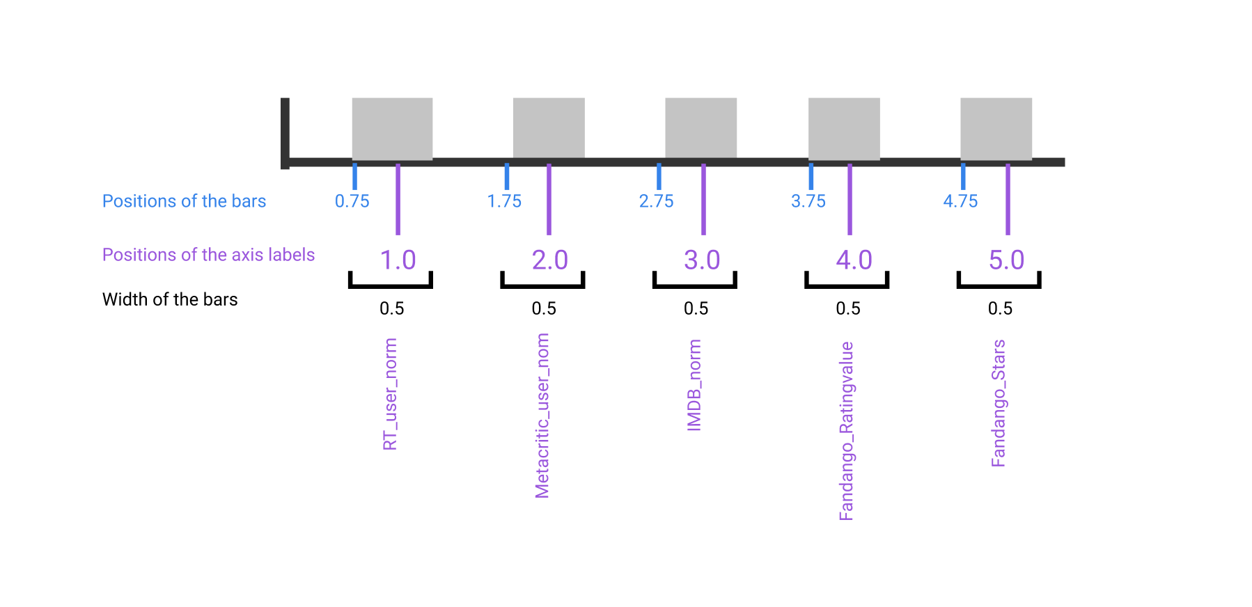
When we generated line charts, we passed in the data to pyplot.plot() and matplotlib took care of the rest. Because the markers and lines in a line chart correspond directly with x-axis and y-axis coordinates, all matplotlib needed was the data we wanted plotted. To create a useful bar plot, however, we need to specify the positions of the bars, the widths of the bars, and the positions of the axis labels. Here's a diagram that shows the various values we need to specify:
We'll focus on positioning the bars on the x-axis in this step and on positioning the x-axis labels in the next step. We can generate a vertical bar plot using either pyplot.bar() or Axes.bar(). We'll use Axes.bar() so we can extensively customize the bar plot more easily. We can use pyplot.subplots() to first generate a single subplot and return both the Figure and Axes object. This is a shortcut from the technique we used in the previous mission:
The Axes.bar() method has 2 required parameters, left and height. We use the left parameter to specify the x coordinates of the left sides of the bar (marked in blue on the above image) (Note that recent versions of Matplotlib use a modified syntax, substituting the parameter xfor the parameter left). We use the height parameter to specify the height of each bar. Both of these parameters accept a list-like object.
The np.arange() function returns evenly spaced values. We use arange() to generate the positions of the left side of our bars. This function requires a parameter that specifies the number of values we want to generate. We'll also want to add space between our bars for better readability:
We can also use the width parameter to specify the width of each bar. This is an optional parameter and the width of each bar is set to 0.8 by default. The following code sets the width parameter to 1.5:
Instructions
Create a single subplot and assign the returned Figure object to
figand the returned Axes object toax.Generate a bar plot with:
leftset tobar_positionsheightset tobar_heightswidthset to0.5
Use
plt.show()to display the bar plot.
By default, matplotlib sets the x-axis tick labels to the integer values the bars spanned on the x-axis (from 0 to 6). We only need tick labels on the x-axis where the bars are positioned. We can use Axes.set_xticks() to change the positions of the ticks to [1, 2, 3, 4, 5]:
Then, we can use Axes.set_xticklabels() to specify the tick labels:
If you look at the documentation for the method, you'll notice that we can specify the orientation for the labels using the rotation parameter:
Rotating the labels by 90 degrees keeps them readable. In addition to modifying the x-axis tick positions and labels, let's also set the x-axis label, y-axis label, and the plot title.Instructions
Create a single subplot and assign the returned Figure object to
figand the returned Axes object toax.Generate a bar plot with:
leftset tobar_positionsheightset tobar_heightswidthset to0.5
Set the x-axis tick positions to
tick_positions.Set the x-axis tick labels to
num_colsand rotate by90degrees.Set the x-axis label to
"Rating Source".Set the y-axis label to
"Average Rating".Set the plot title to
"Average User Rating For Avengers: Age of Ultron (2015)".Use
plt.show()to display the bar plot.
We can create a horizontal bar plot in matplotlib in a similar fashion. Instead of using Axes.bar(), we use Axes.barh(). This method has 2 required parameters, bottom and width. We use the bottom parameter to specify the y coordinate for the bottom sides for the bars and the width parameter to specify the lengths of the bars:
To recreate the bar plot from the last step as horizontal bar plot, we essentially need to map the properties we set for the y-axis instead of the x-axis. We use Axes.set_yticks() to set the y-axis tick positions to [1, 2, 3, 4, 5] and Axes.set_yticklabels() to set the tick labels to the column names:
Instructions
Create a single subplot and assign the returned Figure object to
figand the returned Axes object toax.Generate a bar plot with:
bottomset tobar_positionswidthset tobar_widthsheightset to0.5
Set the y-axis tick positions to
tick_positions.Set the y-axis tick labels to
num_cols.Set the y-axis label to
"Rating Source".Set the x-axis label to
"Average Rating".Set the plot title to
"Average User Rating For Avengers: Age of Ultron (2015)".Use
plt.show()to display the bar plot.
From the horizontal bar plot, we can more easily determine that the 2 average scores from Fandango users are higher than those from the other sites. While bar plots help us visualize a few data points to quickly compare them, they aren't good at helping us visualize many data points. Let's look at a plot that can help us visualize many points.
In the previous mission, the line charts we generated always connected points from left to right. This helped us show the trend, up or down, between each point as we scanned visually from left to right. Instead, we can avoid using lines to connect markers and just use the underlying markers. A plot containing just the markers is known as a scatter plot.

A scatter plot helps us determine if 2 columns are weakly or strongly correlated. While calculating the correlation coefficient will give us a precise number, a scatter plot helps us find outliers, gain a more intuitive sense of how spread out the data is, and compare more easily.
To generate a scatter plot, we use Axes.scatter(). The scatter() method has 2 required parameters, x and y, which matches the parameters of the plot() method. The values for these parameters need to be iterable objects of matching lengths (lists, NumPy arrays, or pandas series).
Let's start by creating a scatter plot that visualizes the relationship between the Fandango_Ratingvalue and RT_user_norm columns. We're looking for at least a weak correlation between the columns.
Instructions
Create a single subplot and assign the returned Figure object to
figand the returned Axes object toax.Generate a scatter plot with the
Fandango_Ratingvaluecolumn on the x-axis and theRT_user_normcolumn on the y-axis.Set the x-axis label to
"Fandango"and the y-axis label to"Rotten Tomatoes".Use
plt.show()to display the resulting plot.
The scatter plot suggests that there's a weak, positive correlation between the user ratings on Fandango and the user ratings on Rotten Tomatoes. The correlation is weak because for many x values, there are multiple corresponding y values. The correlation is positive because, in general, as x increases, y also increases.
When using scatter plots to understand how 2 variables are correlated, it's usually not important which one is on the x-axis and which one is on the y-axis. This is because the relationship is still captured either way, even if the plots look a little different. If you want to instead understand how an independent variable affects a dependent variables, you want to put the independent one on the x-axis and the dependent one on the y-axis. Doing so helps emphasize the potential cause and effect relation.
In our case, we're not exploring if the ratings from Fandango influence those on Rotten Tomatoes and we're instead looking to understand how much they agree. Let's see what happens when we flip the columns.
Instructions
We have provided starter code as comments in the code editor. Select all of these lines and press ctrl + / (PC) or ⌘ + / (Mac) to uncomment these lines so you can use it. For a demo of how this keyboard shortcut works, see this help article.
For the subplot associated with
ax1:Generate a scatter plot with the
Fandango_Ratingvaluecolumn on the x-axis and theRT_user_normcolumn on the y-axis.Set the x-axis label to
"Fandango"and the y-axis label to"Rotten Tomatoes".
For the subplot associated with
ax2:Generate a scatter plot with the
RT_user_normcolumn on the x-axis and theFandango_Ratingvaluecolumn on the y-axis.Set the x-axis label to
"Rotten Tomatoes"and the y-axis label to"Fandango".
Use
plt.show()to display the resulting plot.
From the scatter plots, we can conclude that user ratings from Metacritic and Rotten Tomatoes span a larger range of values than those from IMDB or Fandango. User ratings from Metacritic and Rotten Tomatoes range from 1 to 5. User ratings from Fandango range approximately from 2.5 to 5 while those from IMDB range approximately from 2 to 4.5.
The scatter plots unfortunately only give us a cursory understanding of the distributions of user ratings from each review site. For example, if a hundred movies had the same average user rating from IMDB and Fandango in the dataset, we would only see a single marker in the scatter plot. In the next session, we'll learn about two types of plots that help us understand distributions of values.
Review
Syntax
Generating a vertical bar plot:
pyplot.bar(bar_positions, bar_heights, width)OR
Axes.bar(bar_positions, bar_heights, width)Using arange to return evenly seperated values:
bar_positions = arange(5) + 0.75Using Axes.set_ticks(), which takes in a list of tick locations:
ax.set_ticks([1, 2, 3, 4, 5])Using Axes.set_xticklabels(), which takes in a list of labels:
ax_set_xticklabels(['RT_user_norm', 'Metacritic_user_nom', 'IMDB_norm', 'Fandango_Ratingvalue', 'Fandango_Stars'])Rotating the labels:
ax_set_xticklabels(['RT_user_norm', 'Metacritic_user_nom', 'IMDB_norm', 'Fandango_Ratingvalue', 'Fandango_Stars'], rotation = 90)Using Axes.scatter() to create a scatter plot:
ax.scatter(norm_reviews["Fandango_Ratingvalue"], norm_reviews["RT_user_norm"])
Concepts
A bar plot uses rectangular bars whose lengths are proportional to the values they represent.
Bar plots help us to locate the category that corresponds to the smallest or largest value.
Bar plots can either be horizontal or vertical.
Horizontal bar plots are useful for spotting the largest value.
A scatter plot helps us determine if 2 columns are weakly or strongly correlated.
Resources
Last updated